As usual, here is a brief summary of what we accomplished this week:
- Developed prototypes for all of the UIs .
- Created a set of preferences, including how they will be selected.
- Created/obtained two sets of icons to represent various program functionality. One of these sets is an outline only version, while the other set is full color. We will offer the option to choose between the sets.
- Met once more with Chris, and had a great hands-on workshop on UIViews and delegates.
- Home screen (splash screen)
- Board view (viewing a lecture, past or present)
- Preferences
- Saving a lecture
- Loading a lecture
- About/Help views
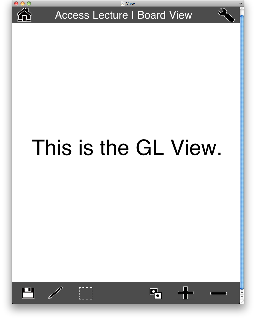
This is the main core of the app; here you can see whiteboard notes drawn in real-time and select various tools and actions. We currently offer the options to save, write your own notes, select a portion of the screen and save it, invert the colors, and zoom in and out. The "GL View" is where the notes will be drawn. Additionally, there are links to the preferences and home screen in the top right and left corners respectively. Note that this particular screenshot shows the outline mode for icons. There is an additional option for full color icons.
( Icons were modified from a free set at http://pixel-mixer.com/ )

This is the preferences screen. No, we won't really be having cities in California as preferences, that table is just Apple's placeholder. We plan to have the settings selection work by listing all the settings in the table on the left, and have the gray view on the right update with options accordingly. The example shown here shows color mapping.

Finally, here we see our home screen, pretty graphic and all. This is very straight forward.
So, those are a few rough rough rough drafts that we can show off. Our next step is to finalize these views (we have many changes to make), and then to finally make these views functional! We have been working diligently on deciding on proper preferences, methods of preference selection, and view switching. We currently have a dummy-app which simply lets you toggle between three views using a button, which applies the same principle that we will want to use in our actual app.
Next week should prove to be very interesting; things are really getting rolling here!
Until next week...
- Alex
No comments:
Post a Comment